TRIPLE O'S
WEBSITE REDESIGN
TRIPLE O'S
WEBSITE REDESIGN
TRIPLE O'S
WEBSITE REDESIGN
TRIPLE O'S
WEBSITE REDESIGN
The website redesign of the Whitespot website was a two part execution that also give its cousin site a renewed website. To ensure that we had the ability to deliver, we created a standardised collection of components that we were able to leverage with some small tweaks for both sites.
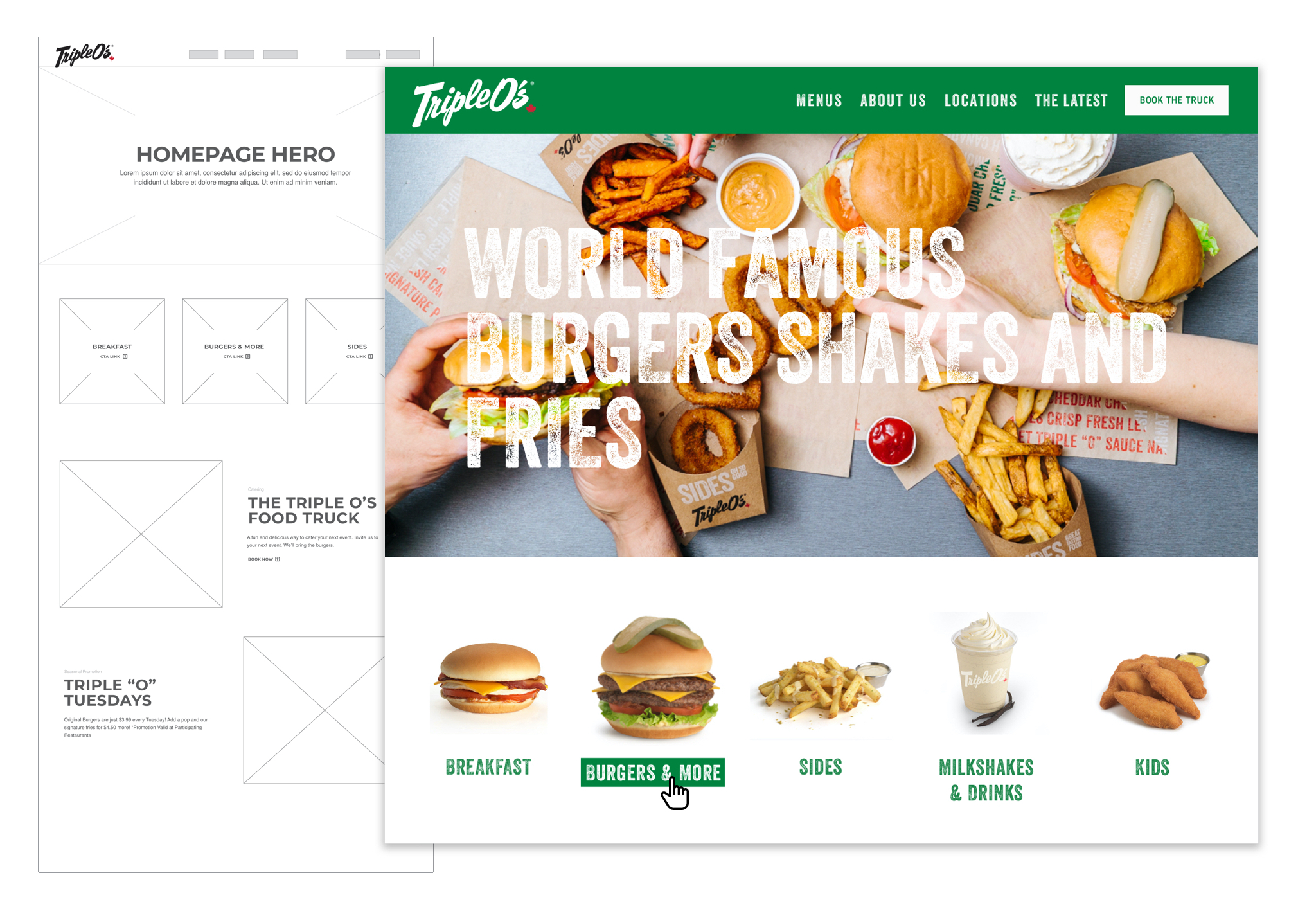
As Triple O's has a smaller, more refined menu we were able to simplify the menu and approach their site with a more playful, expressive approach. The font and imagery became the hero of the site and we took creative direction from creative agency 123 West and their extensive work on the Triple O's social media platforms.
Similarly to Whitespot we split the food offering into seperate pages based on their specific offerings; breakfast, burgers, sides, drinks and kids, then broke those down where the offering was larger. This ultimately made the menu easier to navigate.
This case study is focused on the types of user personas that we targeted as they shaped the pages and experiences that we wanted to curate.
The website redesign of the Whitespot website was a two part execution that also give its cousin site a renewed website. To ensure that we had the ability to deliver, we created a standardised collection of components that we were able to leverage with some small tweaks for both sites.
As Triple O's has a smaller, more refined menu we were able to simplify the menu and approach their site with a more playful, expressive approach. The font and imagery became the hero of the site and we took creative direction from creative agency 123 West and their extensive work on the Triple O's social media platforms.
Similarly to Whitespot we split the food offering into seperate pages based on their specific offerings; breakfast, burgers, sides, drinks and kids, then broke those down where the offering was larger. This ultimately made the menu easier to navigate.
This case study is focused on the types of user personas that we targeted as they shaped the pages and experiences that we wanted to curate.
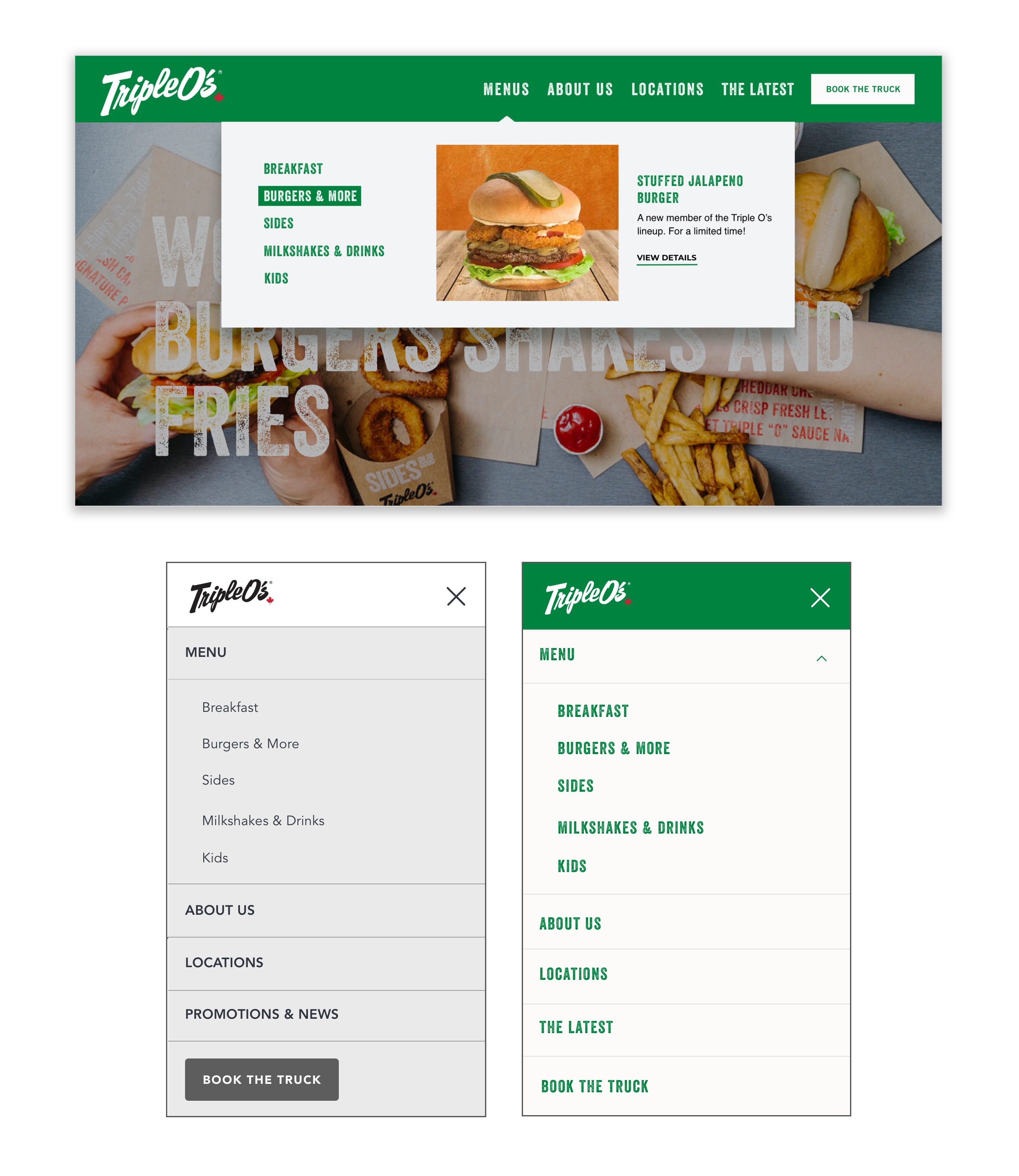
01. Navigational Menu Exploration | Final Menu
03. Navigational Menu Exploration | Final Menu
03. Navigational Menu Exploration | Final Menu
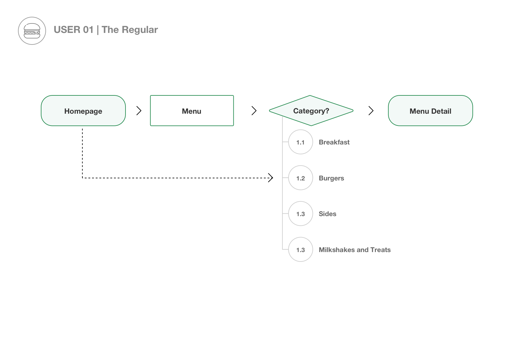
There were 4 basic user flows that we identified.
The first was The Regular:
We curated the menu with this user in mind. The regular is tech savvy and very familiar with the brand. They are looking to browse the menu and potentially be inspired by new specials.
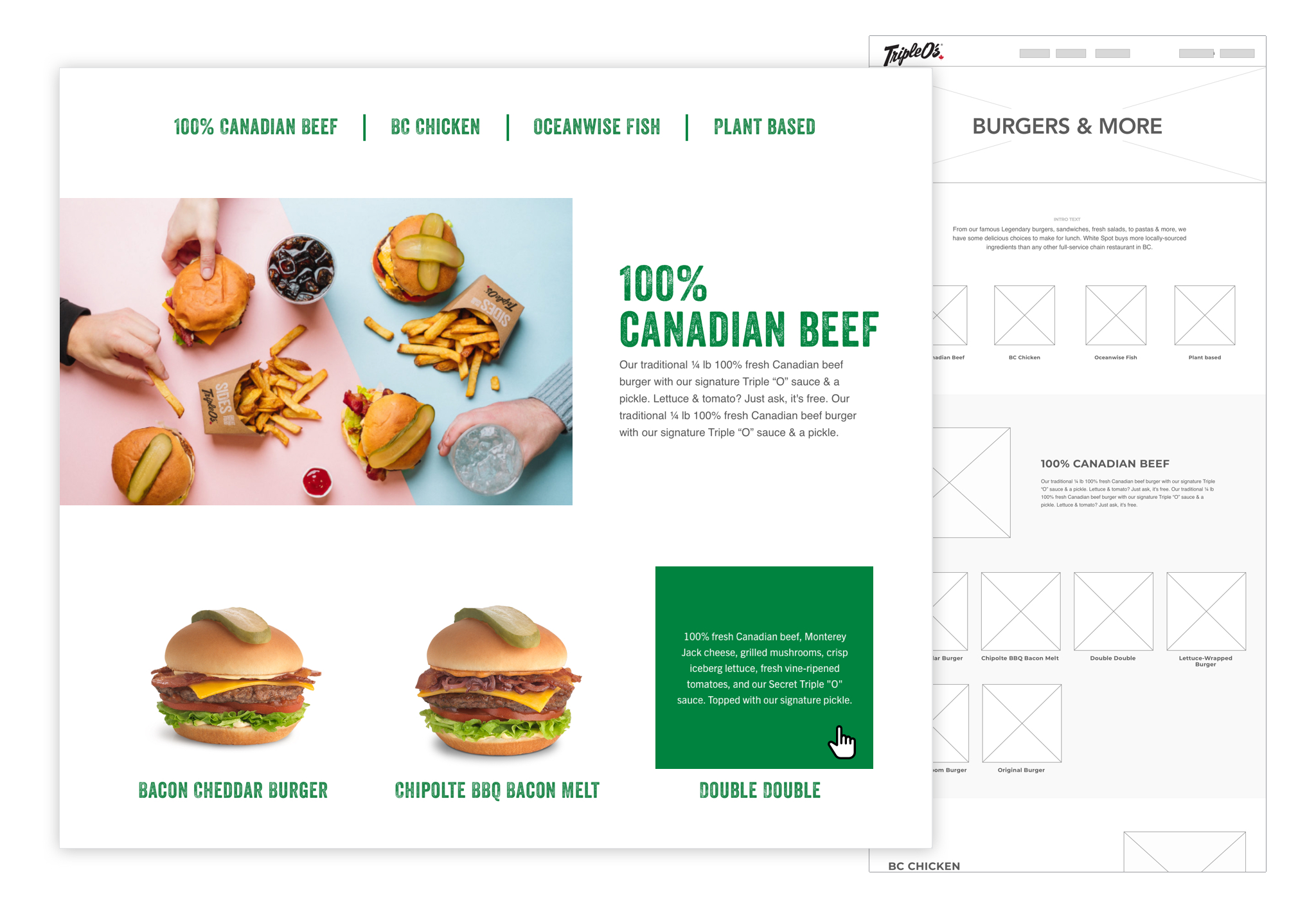
02. Burgers and More | Final design and wireframes
03. Navigational Menu Exploration | Final Menu
03. Burgers and More | Mobile
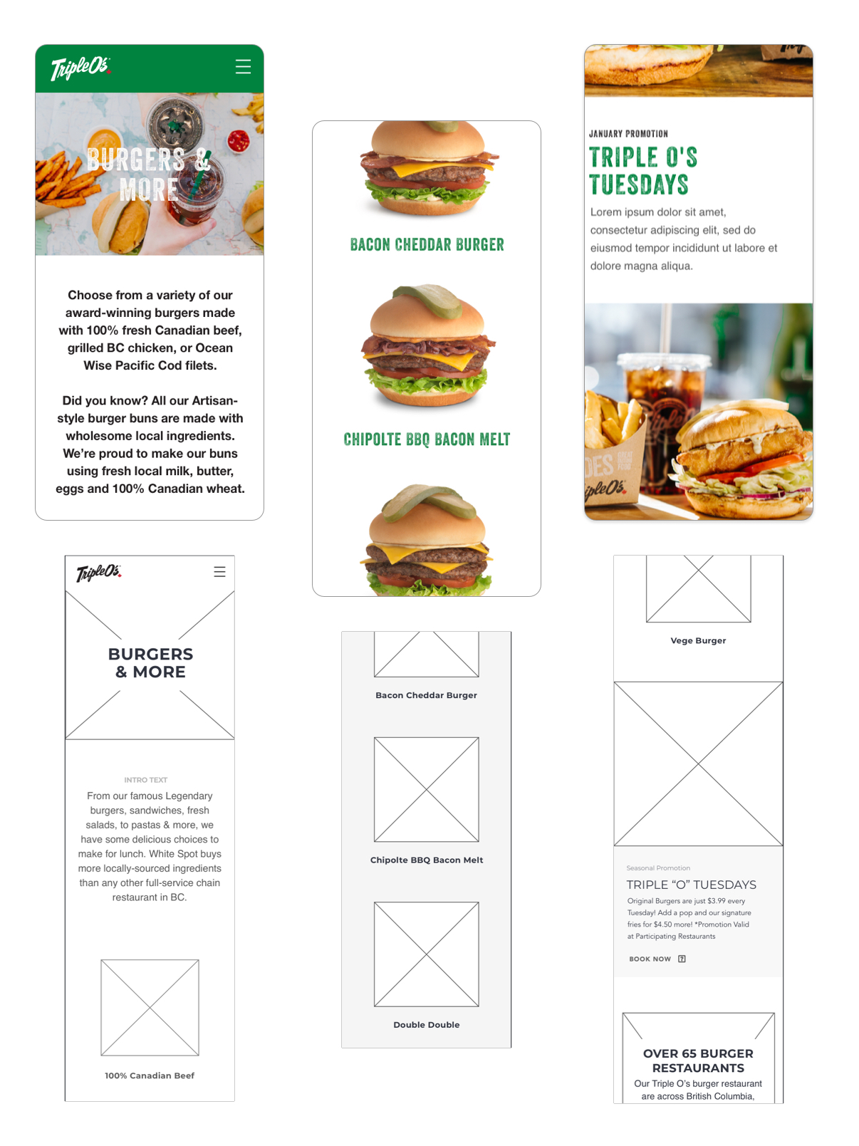
We took the menu into the mobile space in the same way that we did with the desktop however, we simplified the experience and made sure that it was bite-sized and accessible to our users.
Again, in this case we were able to keep things consistent and utilize the shared components from the White Spot mobile interface. This saved time with development and kept the designs fresh.
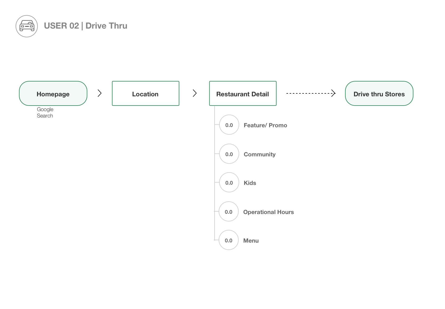
The second user that we identified was
the Drive Thru user:
This user is looking for a quick meal, is curious about what stores offer drive thru, or someone with piqued interest after seeing marketing or a store front.
We made sure that there was an easy way for users that were of this mindset to quickly access the location finder, and we were able to use the backend of the shared components used for the White Spot execution.
We also integrated the use of filters and icons to identify if each location had special offers such as gift cards and delivery.
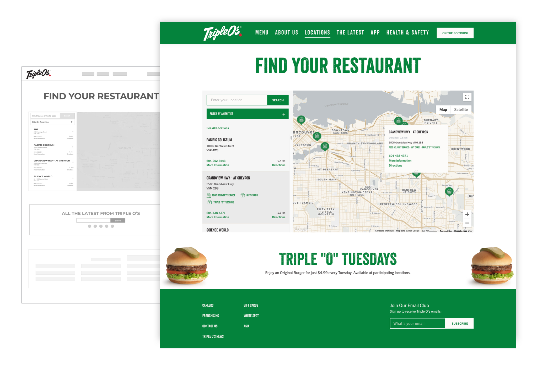
04. Locations | Desktop
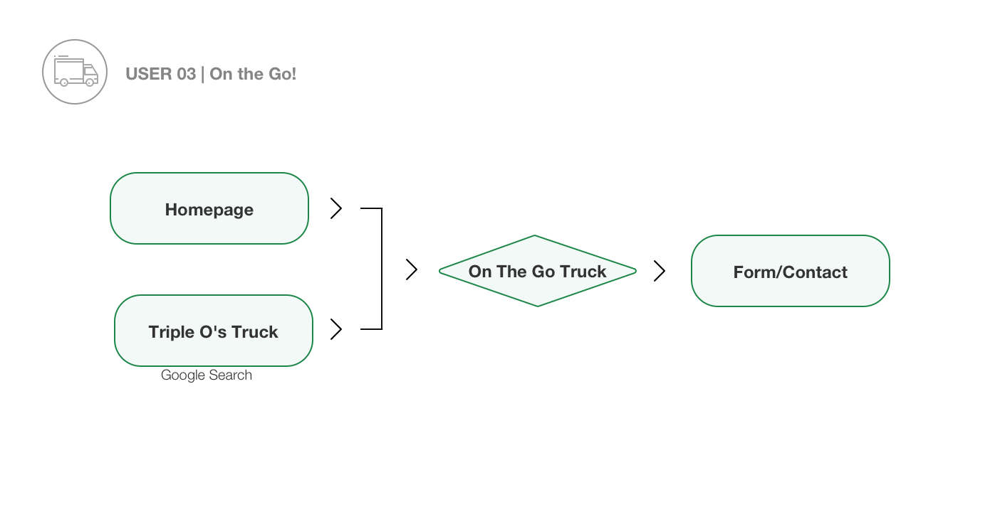
The third, fairly niche user is the On the Go! user. This user is looking to book or find out more about catering for an event.
The team at Triple O's expressed to us how important enabling simplified access to the catering section of their business was, their old system was clunky and involved people coming into stores or making many phone calls to get what they needed.
As this user is a little bit of an outlier we provided a online form that would allow them to create an enquiry for renting a Triple o's truck. This allows the team to follow up with the user directly, streamlining this process.
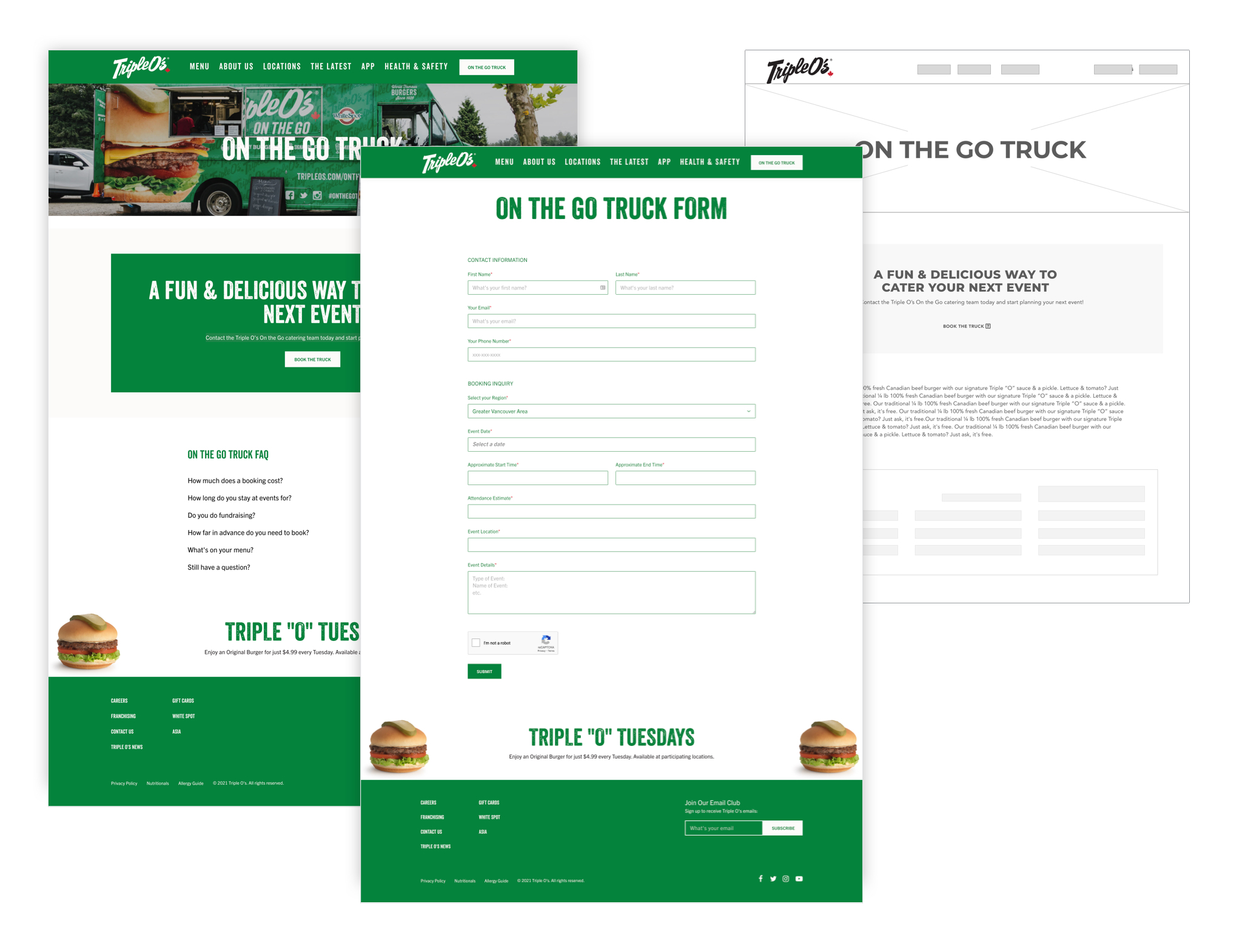
05. On the Go Truck + Booking form | Desktop
07. Locations | Desktop
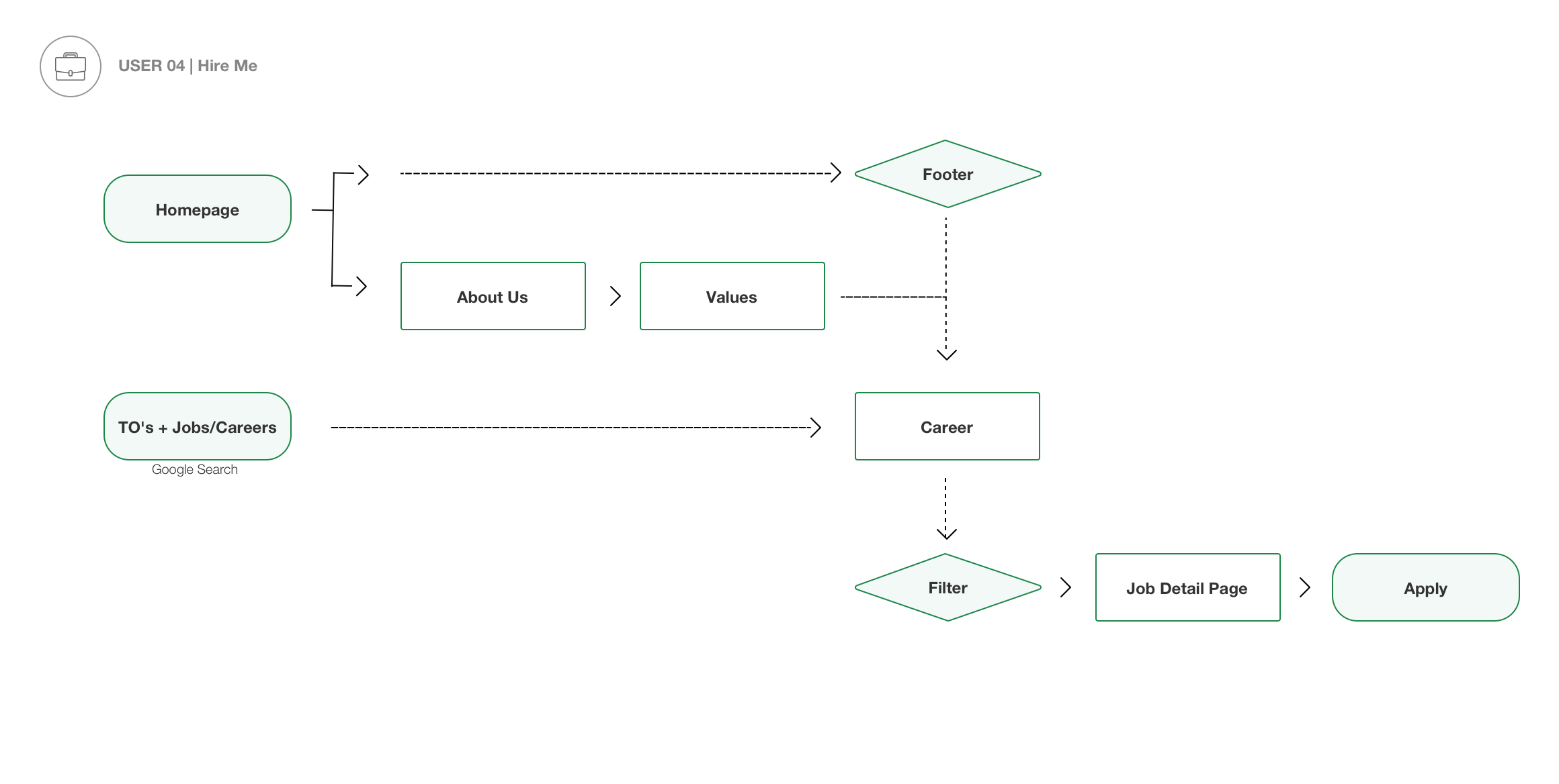
The final user persona that was very important
to the Triple O's team was the Hire Me user.
The team stressed to us that they wanted to move from paper based applications to creating a backend solution that allowed them to generate interest in job openings company wide. This way people would be able to submit web forms on the site itself, that created a database of applicants that could be catalogued for all the available positions.
We filtered the jobs by 4 categories, using the existing foundations utilized on the White Spot site, and kept the development time down by integrating these shared components for the careers section as well. This also meant much a simpler user experience for applicants.
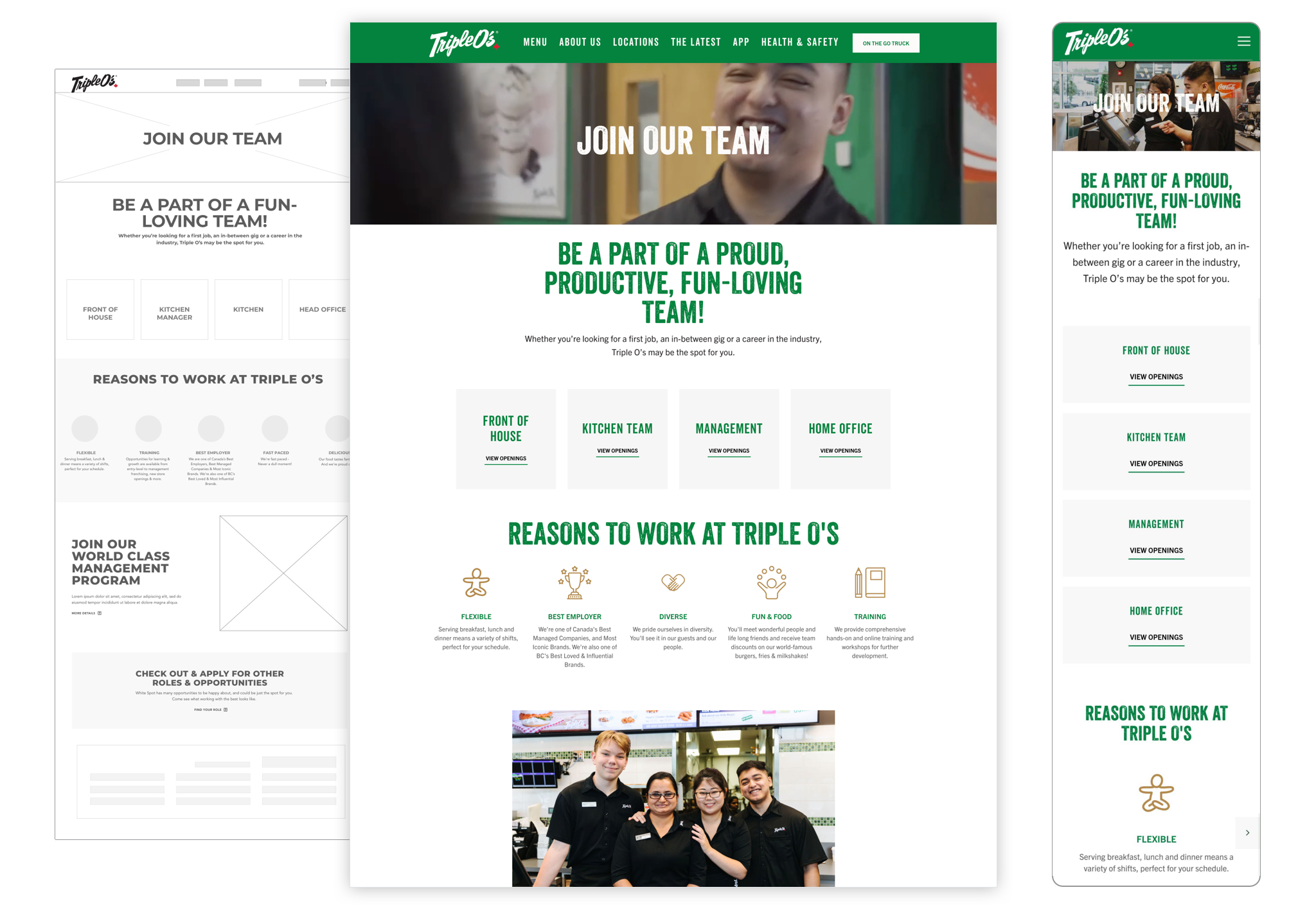
Careers page | Desktop and Mobile